

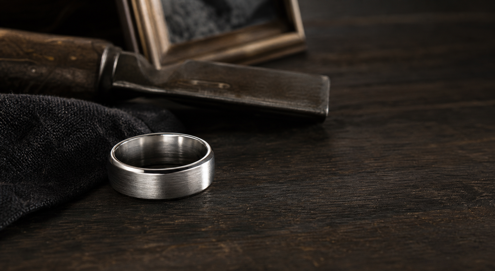
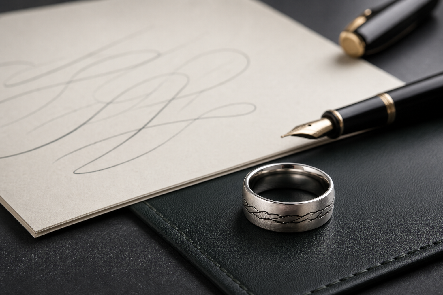
The strongest version of this ring comes from the single source detail that still feels closest to the relationship. Build the rest of the design around it, not alongside it.
A first name, years together, a fingerprint, a note in their handwriting, a favorite flower, a service mark, or a pet print can each work well on their own. Trouble starts when two or three of them compete for the same space on the band.
the visible side should carry only the strongest source detail, while dates and private words can sit inside. Keeping that split clear is what keeps the ring from feeling crowded.
quiet silver, brushed finishes, and darkened engraving grooves keep the ring calm enough for daily wear. The finish should make the engraving easier to read, not just look premium in a photo.
choose words that still help on ordinary days, such as "Still With Me," "Until We Meet," a nickname, or one family phrase. Fewer words usually engrave more clearly than a full sentence.
gather the best original source files before designing: full photo, close crop, scan, print, note, or symbol reference. Send the original file when possible instead of a screenshot or a copy of a copy.
let one memory lead and use the rest of the ring to support it with space, contrast, and restraint. Supporting details should clarify the main idea, not decorate around it.
Avoid do not turn the band into a life-summary list when one exact source detail would feel more personal. A simpler design almost always ages better than a crowded one.
The real decision is this: decide whether the ring should comfort privately, be recognized by family, or stand as a visible tribute. Once that is settled, the rest of the choices move quickly.
With that settled, bring the name, relationship, date, source file, and a short story note into the Friends of Irony designer.