
Most designs go wrong when buyers pick fonts and symbols before deciding on one recognizable print area paired with a name or date. Decide that first, then let it guide the rest.
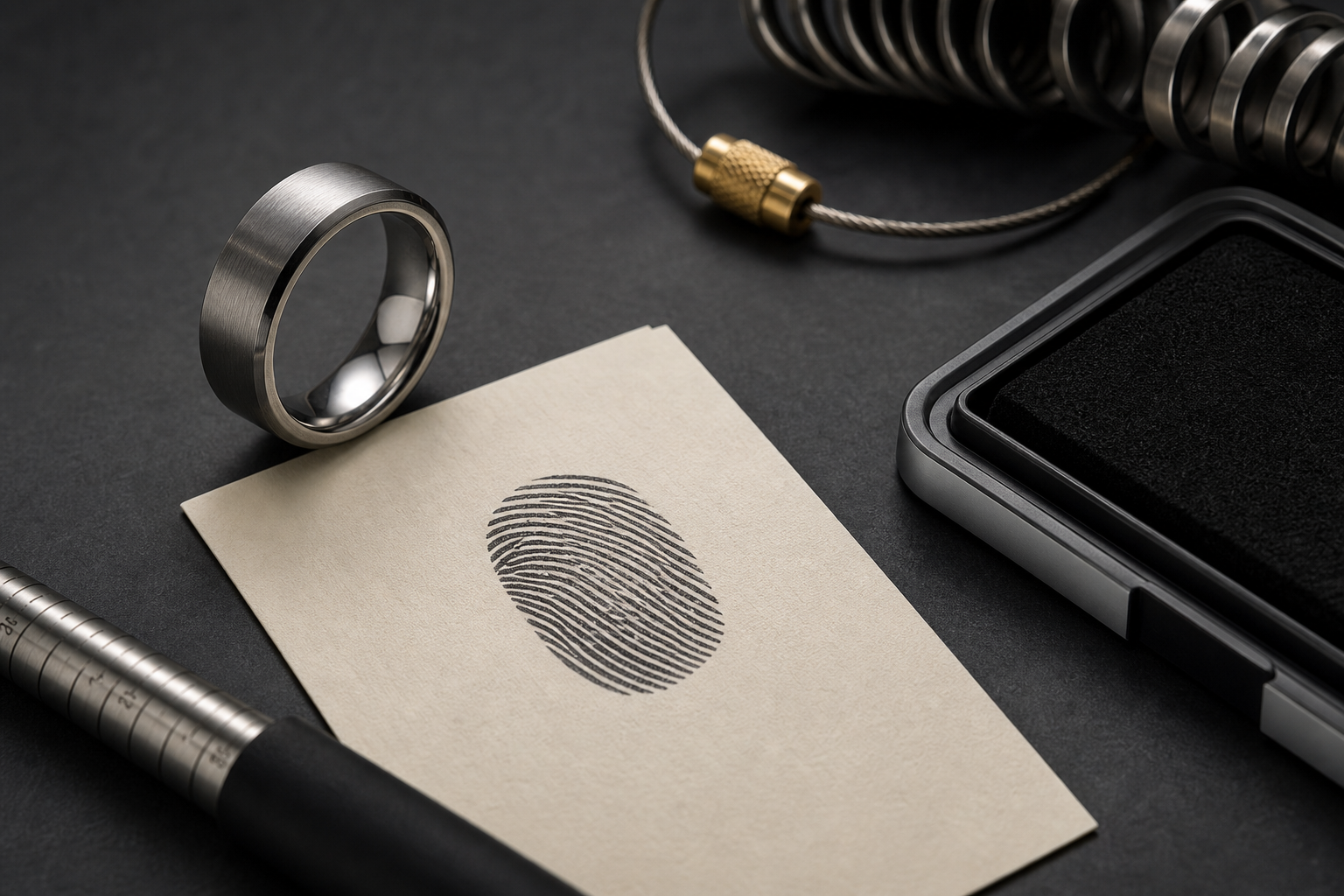
A fingerprint panel, initials, "Still With Me," a first name, birth/death years, or a hidden inside phrase can each work well on their own. Trouble starts when two or three of them compete for the same space on the band.
outside prints make the tribute visible; inside prints keep the connection private. Keeping that split clear is what keeps the ring from feeling crowded.
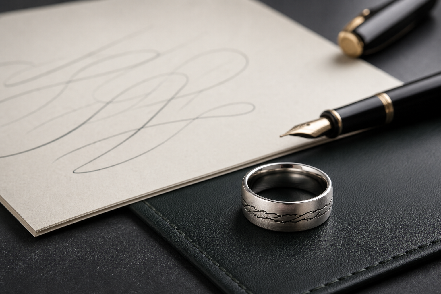
silver-tone bands feel calm, while dark grooves can give the fingerprint stronger definition. The finish should make the engraving easier to read, not just look premium in a photo.
use one short phrase so the print remains the emotional center. Keep a shorter backup version ready in case the chosen band has limited engraving space.
send the highest-resolution print available and include the full source image if it came from an old document. Send the original file when possible instead of a screenshot or a copy of a copy.
frame the best ridge section and add a small date or name rather than filling the band edge to edge. Resist the urge to fit in every meaningful detail; pick the one that matters most.
Avoid avoid using a smudged print if another family member has a cleaner copy. A simpler design almost always ages better than a crowded one.
The real decision is this: choose whether this is a private grief piece or a visible memorial gift. Once that is settled, the rest of the choices move quickly.
With that settled, bring the print, name, date, and relationship note into the Friends of Irony designer.