
Most designs go wrong when buyers pick fonts and symbols before deciding on the custom element only this family would choose. Decide that first, then let it guide the rest.
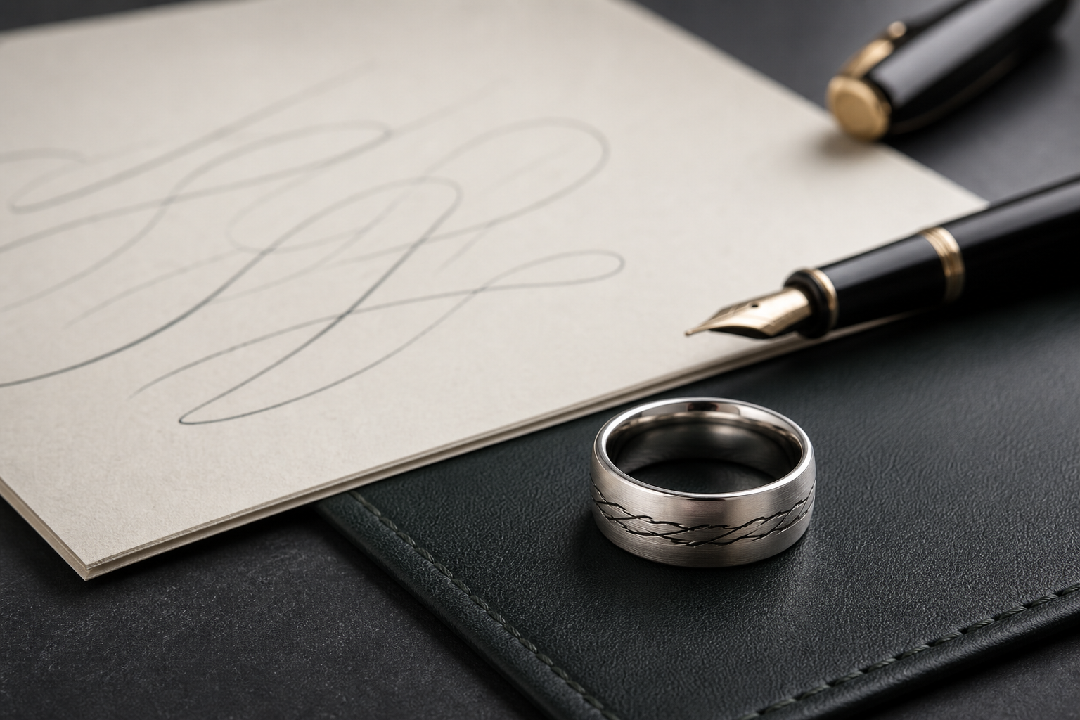
Consider a signature, coordinates of home, a recipe word, a service badge, a birth flower, a fingerprint, a portrait silhouette, or initials. The right choice is whichever one still feels personal after the ring has been worn for a while, not just in the first week.
personal source artwork usually needs visible outside space, while names and dates can remain inside. That decision should come before font, symbol, or finish choices, not after.
choose a finish that matches the memory: soft brushed silver for quiet remembrance or darker contrast for stronger source marks. Test the finish against daily wear and work routines before locking it in.
write the shortest phrase that identifies the person, promise, or family bond. Read it out loud before finalizing; wording that sounds right out loud usually reads right on metal.
send both the original source and a cropped close-up so the designer can preserve the personal part accurately. Blurry or low-contrast files force the design to guess at details that should be intentional.
personalization should narrow the design, not add more clutter; one custom source plus one anchor detail is enough. One clear lead detail reads better than several smaller ones competing for space.
Watch for avoid treating personalization as a menu of every possible option rather than a decision about the one detail that matters. These are the details that look fine on screen and disappoint once engraved.
Before going further, decide which detail would make the wearer say, "this could only be ours". That answer should guide the phrase, finish, and placement that follow.
The next step is simple: bring the exact custom source, name, date, and design note into the Friends of Irony designer.