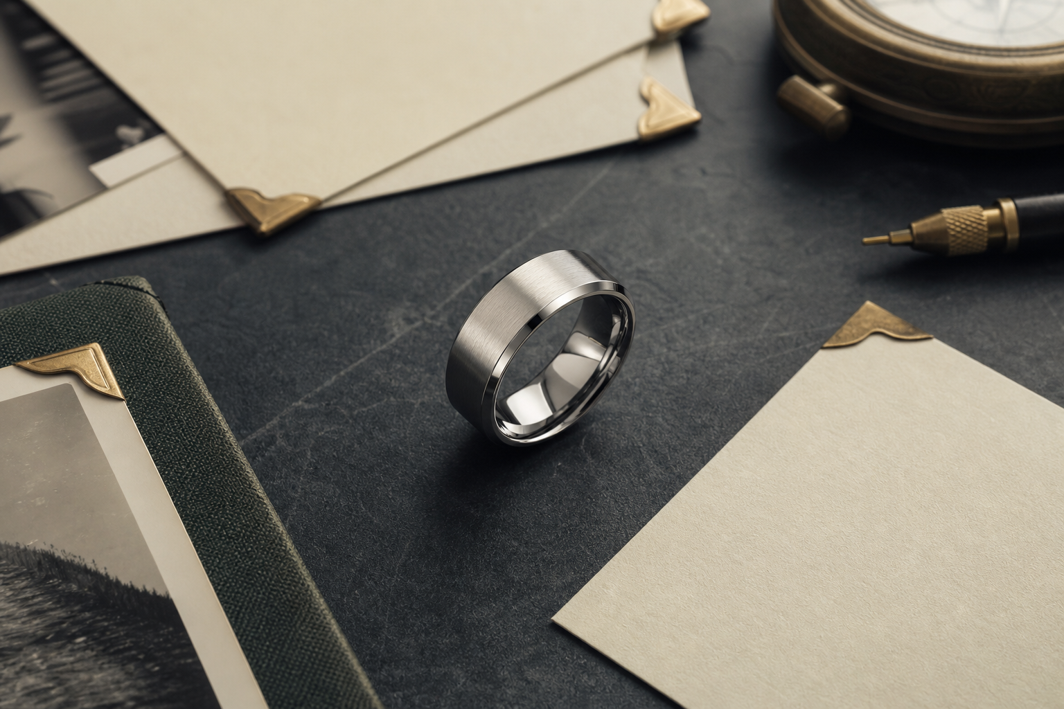

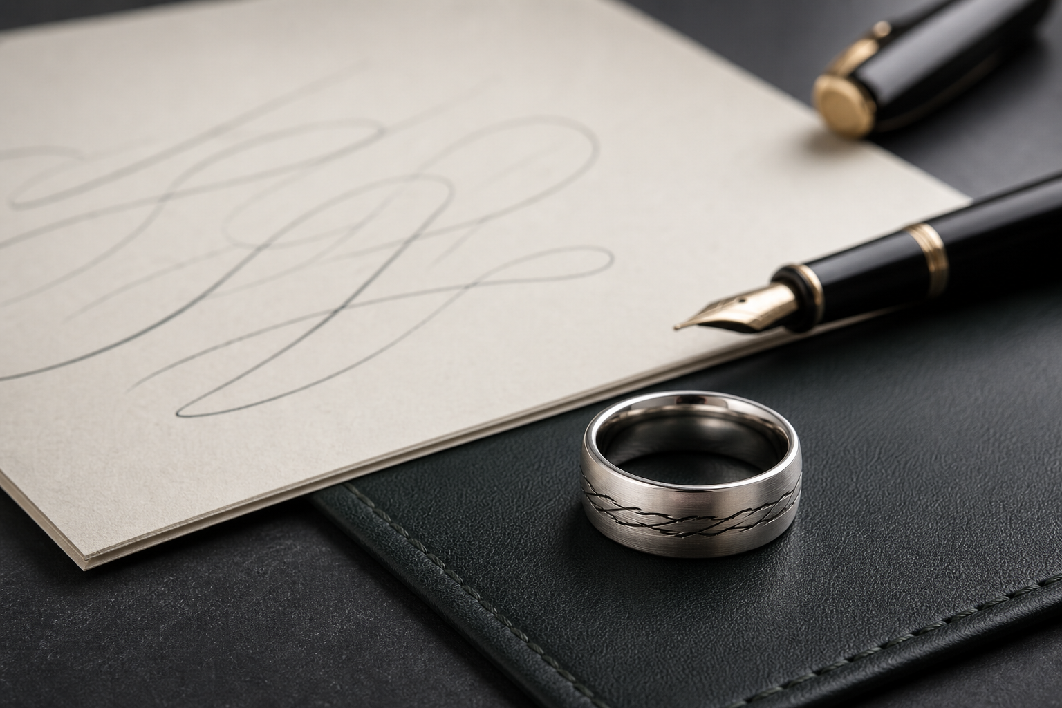
The phrase, name, date, or promise that should be read again and again is the detail worth designing around here. It connects directly to choosing a few memorial words that can actually fit and comfort on a ring, which is what keeps the ring personal instead of generic.
"Still With Me," "Until We Meet," "Love Stays," "Dad," "Mama," initials, years lived, or a short faith phrase can each work well on their own. Trouble starts when two or three of them compete for the same space on the band.
longer emotional wording belongs inside, while the outside can hold a name, symbol, print, or simple border. That decision should come before font, symbol, or finish choices, not after.
high contrast helps short words stay readable, especially on narrow bands and darker finishes. Choose the finish based on how the ring will actually be worn, not just how it looks in a first mockup.
favor real family language over dramatic sentences; the ring should still feel steady after grief changes shape. Read it out loud before finalizing; wording that sounds right out loud usually reads right on metal.
if the words come from handwriting, a card, or a note, send the original image and typed confirmation. Prepare this before opening the designer so the session moves quickly.
pair one phrase with one anchor detail such as a date, name, print, or small symbol. Everything on the band should point back to the same idea.
The most common issue is avoid sentences that need punctuation, explanation, or very small letters to fit. Catching it before ordering saves a redo later.
The question worth answering early is what whether the engraving should comfort, identify, honor faith, or preserve a private family phrase. It shapes everything that comes after.
From there, bring two phrase options, the name, date, and any handwriting source into the Friends of Irony designer.