
Most designs go wrong when buyers pick fonts and symbols before deciding on the dad-specific mark that would make the family recognize him. Decide that first, then let it guide the rest.
Dad, Papa, a handwritten signature, a tool outline, badge, cross, fishing hook, truck detail, service emblem, or "Still Guiding Me" can each work well on their own. Trouble starts when two or three of them compete for the same space on the band.
one strong outside symbol works well for a dad ring, with the name, date, or private line inside. Decide this before finalizing artwork, since it changes how much detail the design can actually hold.
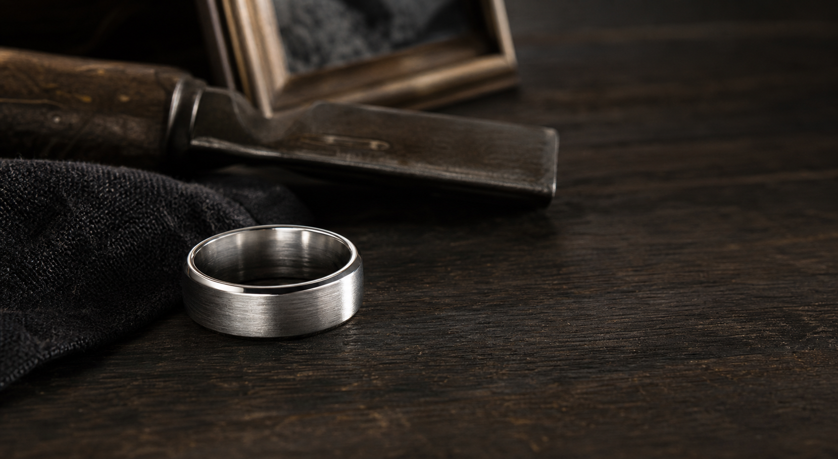
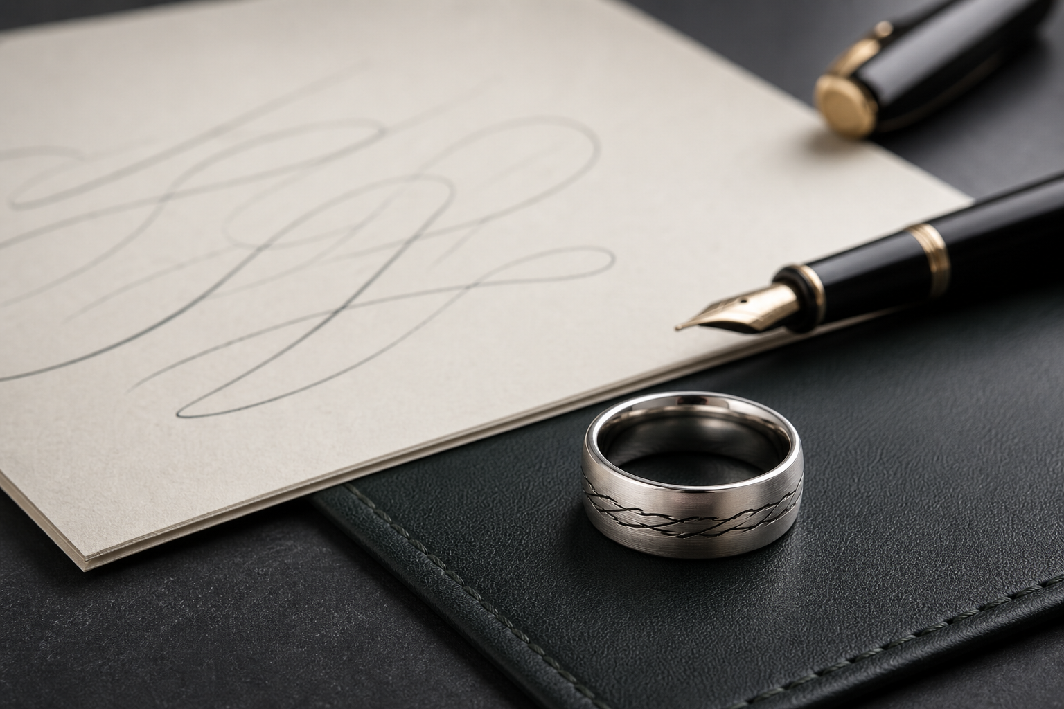
brushed silver, black bands, and tungsten-style finishes can make the tribute feel sturdy rather than decorative. Choose the finish based on how the ring will actually be worn, not just how it looks in a first mockup.
plain language fits a dad memorial ring: "Dad," "Walk With Me," "Hold Fast," or a phrase he actually used. Say it exactly the way it should be read, then trim anything that is not doing real work.
send a clear card, note, tool photo, service reference, or hobby image and explain why it belongs to him. Blurry or low-contrast files force the design to guess at details that should be intentional.
combine one masculine source detail with one family anchor, such as initials, date, or handwritten word. A ring with one clear center of meaning almost always outperforms one with several.
Watch for avoid stacking every role and hobby onto the band; choose the one that feels most like him. These are the details that look fine on screen and disappoint once engraved.
The question worth answering early is what whether the ring should carry his protection, humor, work ethic, faith, or service. It shapes everything that comes after.
Bring it into the designer once ready: bring the dad name or title, date, symbol or handwriting file, and a short family note into the Friends of Irony designer.