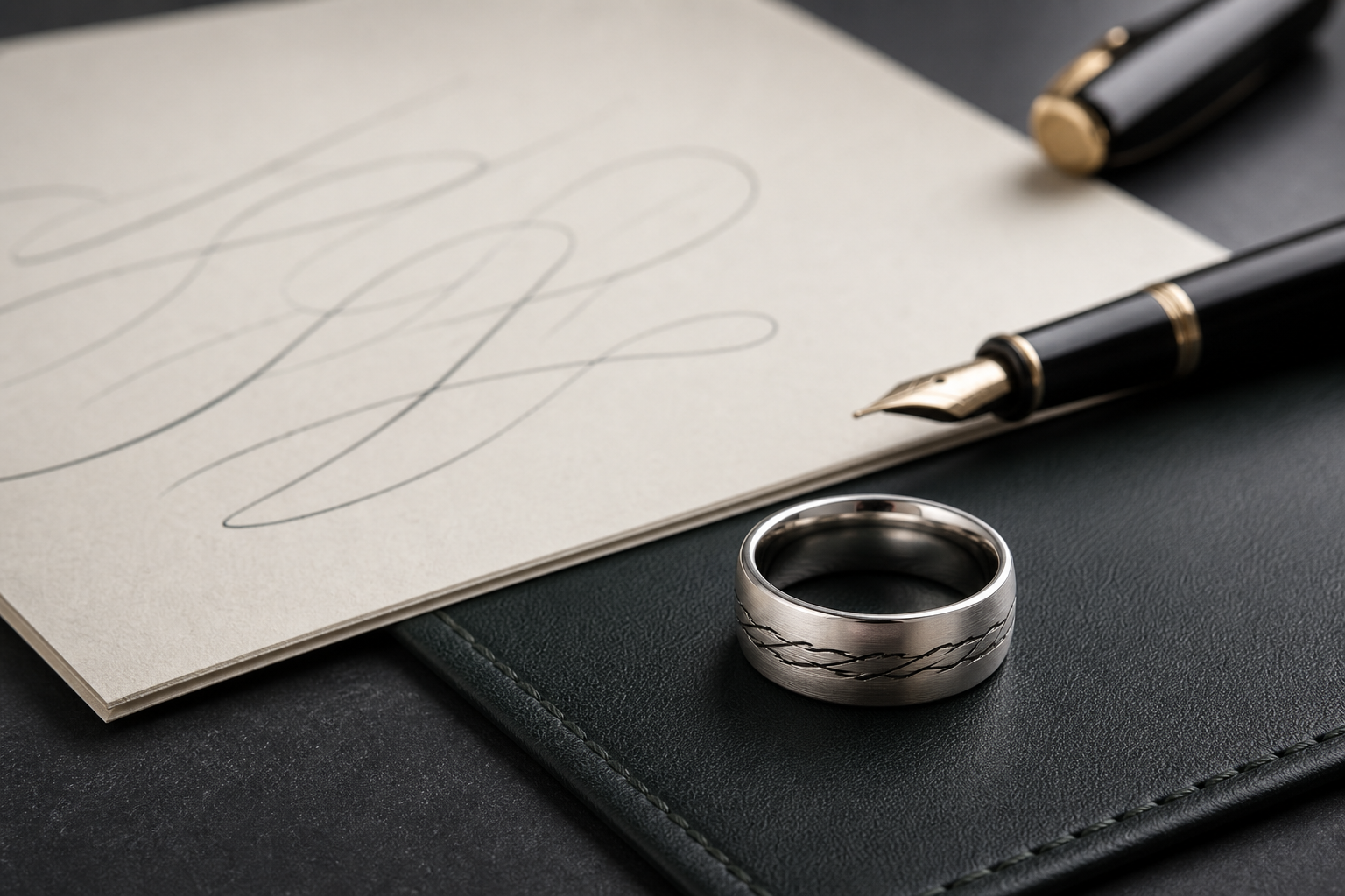

Most designs go wrong when buyers pick fonts and symbols before deciding on the signature, short note, recipe word, card phrase, or handwritten nickname. Decide that first, then let it guide the rest.
A signature, "love you," "Mom," "Dad," a recipe-card word, a note from a card, or one short phrase from a letter give you real options. Choose based on what the wearer will still recognize months from now, not what looks strongest in a first sketch.
handwriting can sit outside if it is short and bold, while a date or private phrase can stay inside. Private and visible details rarely work well sharing the same space, so give each side of the band one job.
brushed silver and darkened grooves help thin handwriting stay visible without making it look harsh. Consider how the finish will hold up after months of regular wear, not only on day one.
keep the original strokes whenever possible and use typed text only to confirm what the handwriting says. Keep a shorter backup version ready in case the chosen band has limited engraving space.
photograph the paper straight on in daylight and include both the full note and a close crop of the selected words. Send the original file when possible instead of a screenshot or a copy of a copy.
let the handwritten mark be the center and support it with only one date, name, or small symbol. Resist the urge to fit in every meaningful detail; pick the one that matters most.
Avoid avoid long handwritten sentences that lose the recognizable pressure and spacing when reduced to ring size. A simpler design almost always ages better than a crowded one.
Choose the word or signature the wearer would recognize before choosing other memorial symbols. That decision matters more than any single symbol or font choice.
With that settled, bring the handwriting photo, typed confirmation, name, date, and relationship note into the Friends of Irony designer.